Colours
The SFI brand colour palette consists of the primary brand colours—the blue, green and grey derived from the logo—along with a secondary colour palette to compliment the primary and act as accent in various applications. The logo should only ever be presented in the primary colour palette, in black against light backgrounds, or white against dark backgrounds.
Below you will find colour swatches for the brand colours with their HEX code for web use, RGB value for screen use, CMYK for common print use, and spot for high-quality print use.
A note on printing and inks. When choosing a colour for printing ensure the colour space is in CMYK. For most common printing applications CMYK colours are adequate; however, there may be cases where the exact colour match is preferred. Using a spot colour, in SFI’s case Pantone colours, you ensure that the printer uses the exact ink produced by Pantone and that colours will match across different print runs. When printing using a four-colour process, or CMYK, there may be slight variations in colours across multiple print runs because each time the colour is mixed using a combination of cyan, magenta, yellow, and black. Some small deviation of error may exist in the printer’s facility.
Primary Brand Colour Palette
The primary brand colours are derived from the logo and should be the most prominent colours used throughout all materials. The primary colours are blue, green and gray though white should also be considered an essential part of the palette. The use of white space contributes to the modern and open feel of the brand, giving space for design elements to breathe.
Blue
Hex: #0061ad
RGB: 0 97 173
CMYK: 86 62 2 10
Spot: Pantone 7686 UP
Green
Hex: #85c559
RGB: 133 197 89
CMYK: 51 0 86 0
Spot: Pantone 368 UP
Warm Gray
Hex: #7f756f
RGB: 127 117 111
CMYK: 50 48 50 13
Spot: Pantone Warm Gray 11 UP
Secondary Colour Palette
The secondary colour palette is designed to complement the primary palette and can be used to accent or provide emphasis to design elements. These colours will also be used throughout web and app platforms. This colour palette maintains the bright and energetic tone of the brand.
Secondary colours should be used sparingly, as an accent. A few guidelines for secondary colours are:
- Do not create large areas of these colours, use primary colours for large areas
- Do not overuse colours, limit use to one or two accent colours
- Ensure primary colours are most prominent
Red
Hex: #ff4343
RGB: 255 67 67
CMYK: 0 88 73 0
Orange
Hex: #ff851b
RGB: 255 133 27
CMYK: 0 58 97 0
Yellow
Hex: #ffdd33
RGB: 255 221 51
CMYK: 2 10 90 0
Teal
Hex: #29ccc4
RGB: 41 204 196
CMYK: 65 0 31 0
Fuchsia
Hex: #f249d2
RGB: 242 73 210
CMYK: 18 78 0 0
Purple
Hex: #b02bcc
RGB: 176 43 204
CMYK: 46 85 0 0
Black
Hex: #1c1c1c
RGB: 28 28 28
CMYK: 72 66 65 77
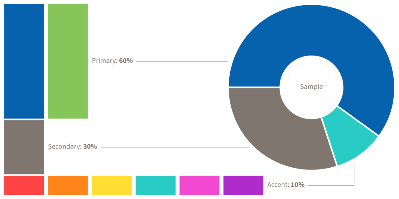
Below is a chart visually representing the relative weight or prominence colours should have in a design. A primary brand colour, i.e. blue, should be chosen to be most prominent, roughly 60% of all colours used. The secondary colour of the design can be another brand colour, i.e. green or gray, at roughly 30%. Finally, an accent colour can be chosen from the secondary palette at roughly 10%.