Cover Designs
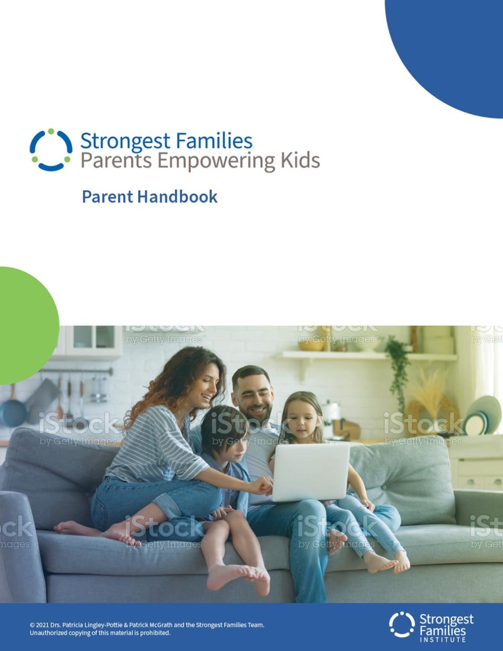
Marketing materials for SFI cover a broad range of mediums and formats. Program materials make up a large portion of these materials and therefore act as a good reference point for design decisions. Below are two samples of cover designs utilizing photographs and illustrations for two different audiences.
Considerations
- White space. Also known as negative space; using ample white space gives design elements room to breathe and can add emphasis to individual elements. The negative space around objects helps lead the viewer’s eye around the material.
- Graphical elements. Using the circle element from the logo can add dynamic energy and a splash of colour to designs. In the examples below the circle is positioned to flow off of the page, creating a bit of tension and a feeling that there is more content to come.
- Hierarchy. As outlined in the Placement and Positioning section of Logo Usage, consider the primary goal of the material. If promoting a program those elements should be most prominent.