Logo Usage
The complete logo package contains more than 200 individual files covering the variations of English, Bilingual, stacked, horizontal and with or without the tagline combined with different colour spaces for print versus web, and file types. Knowing which file to use is no small task.
Files are labelled to assist in the selection, using a format that covers the language variation, lockup variation and colour space. For example, the Adobe Illustrator file for the horizontal lockup of the bilingual logo in CMYK is labelled “sfi-bilingual-horizontal-cmyk.ai.”
Minimum Size
The minimum size the logo should display at is a height of 0.5 in / 13 mm. This ensures the tagline is legible.
Print versus Screen
The most basic difference between files is the colour space and how those relate to usage. The SFI logo was developed with spot colours, also known as Pantone ink colours. When printing with spot colours you are guaranteed the most accurate colour representation because much like choosing paint from a store, there is a specific formula for that ink colour. Not all print jobs require that level of detail, nor do they require the extra cost associated with spot colour printing. For those cases, the logo colours have been converted to a 4-colour process, or cyan, magenta, yellow, and black (CMYK). This colour space will produce predictable results, though when comparing the same printed material from different print runs there may be slight shifts in the colour. This colour space is ideal for lower-quality print jobs.
For screen usage, the only colour space appropriate to use is red, green, blue (RGB).
Each logo variation comes in four file formats, AI, EPS, PNG, and SVG.
- AI – Adobe Illustrator source file. This is a vector format file that contains the shapes and colours of the logo. This can be embedded or linked in other Adobe applications such as InDesign or Photoshop
- EPS – Encapsulated PostScript. This is also a vector format file that has broader use and is compatible with more applications outside of the Adobe Creative Suite.
- PNG – Portable Graphics Format. This is a raster format, ideal for ‘flat’ graphics that have no shading or gradients. The file allows for transparency and is only available in RGB colour space and therefore is only for screen use. These files produce high quality raster graphics with reduced file size.
- SVG – Scalable Vector Graphic. This is a vector format for screen use. It is currently only available in RGB colour space. Using this format where it is supported on screens offers the highest quality, sharp and clean edges.
- Use AI or EPS file formats
- Use CMYK, spot, white or black
Screen
- For creating graphics use AI or EPS in RGB colour space
- For adding images to websites, social media platforms, etc. use PNG or SVG where supported.
Logo Colour
When possible it is preferred to use the full-colour version of the logo. However, the full-colour logo should only be used on solid light backgrounds, such as white and light shades of grey. Bear in mind, that the tagline is set in a tone of grey, so when using the logo variation with tagline it is preferred to only use a white background or very light grey to maintain appropriate contrast.
- Full-colour Logo. The full-colour logo should be used on white backgrounds or light shades of grey.
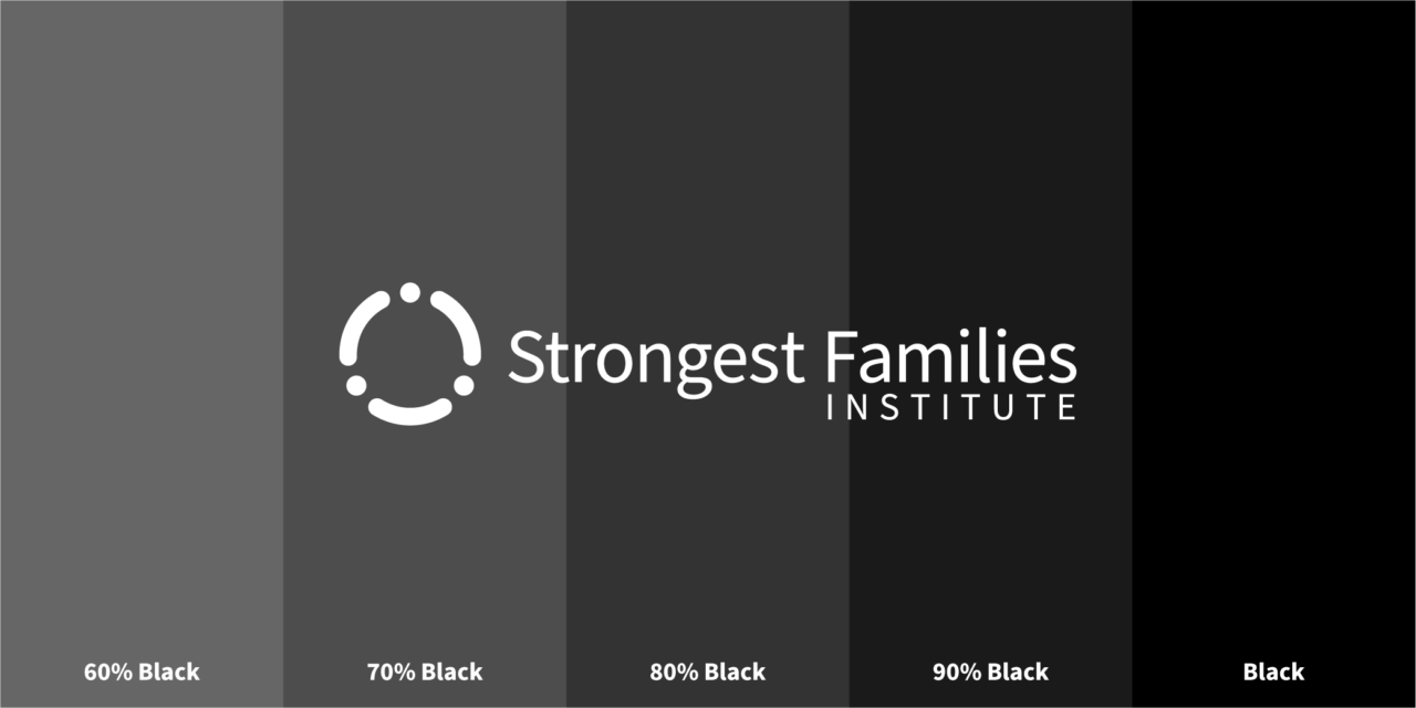
- White/Reverse Logo. The white, or reverse, logo, should be used on solid backgrounds with a tonal value between 100% and 55% black. The brand blue falls within this range, however, the brand green is lighter and should be used only when the logo can be presented in a large format.
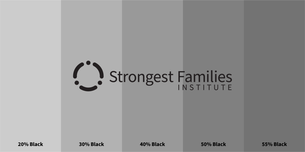
- Solid Colour/Black Logo. The black logo is for applications that require no colour and can be used on backgrounds that fall within a tonal range lighter than 55% black.

Clearance
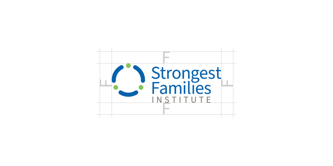
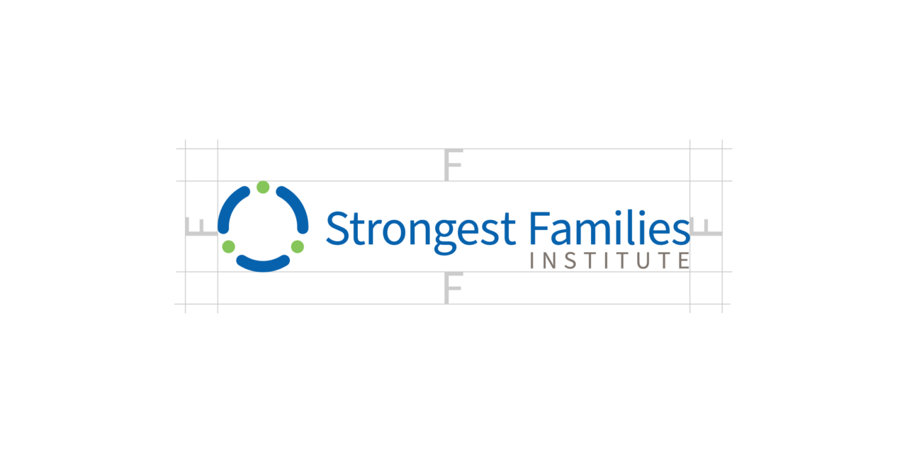
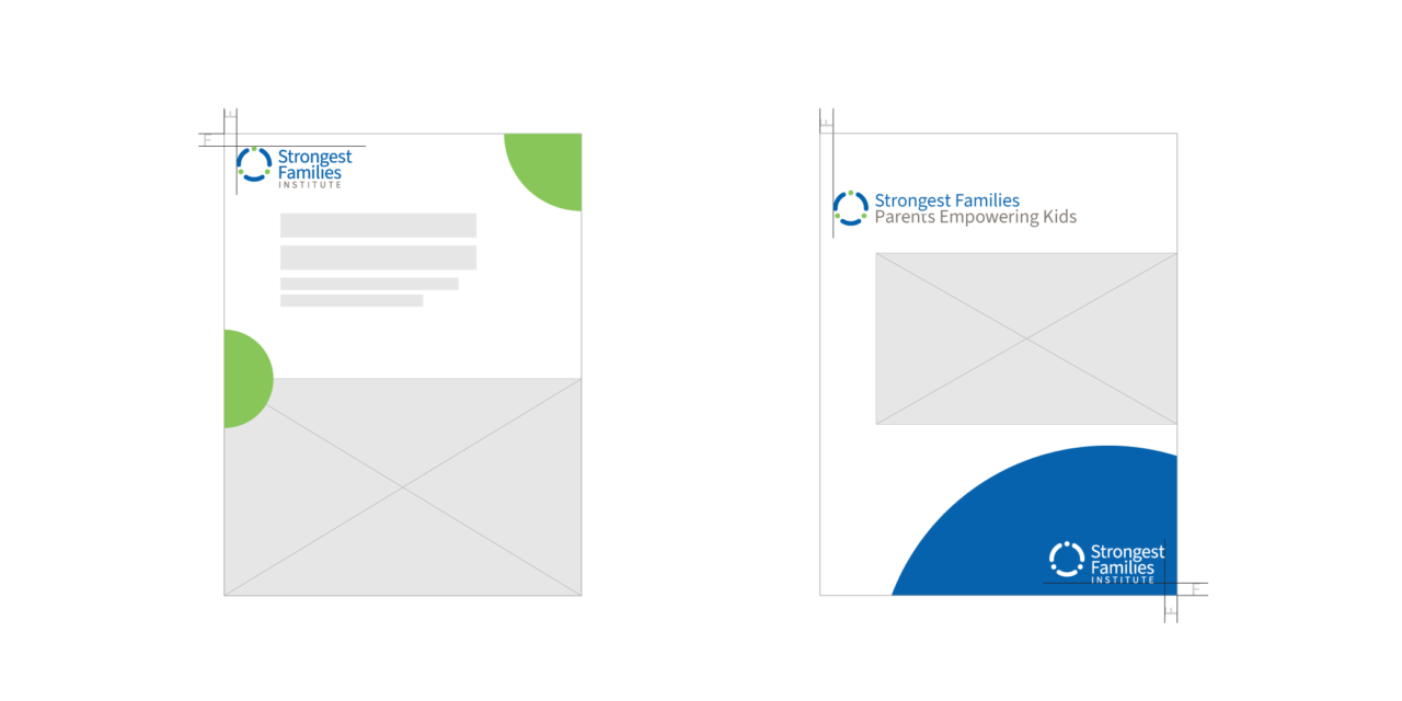
Ensure the display of the logos is clear and visible by providing enough white space around the logo. Simply use the uppercase ‘F’ as a guide for the minimum amount of space to be retained around the logos.
Placement and Positioning
When placing the logo on a document it is important to consider the purpose of the document and how the brand relates. Regardless of where the logo is placed on a document, you must always maintain at least the minimum space around the logo as outlined above.
Promoting SFI
When the primary purpose of the marketing material is to promote Strongest Families as an organization the SFI logo should be prominent and preferably in full colour. The logo should be positioned in the top-left of the document to catch the reader’s eye immediately. Remember the minimum space to preserve to the left and top of the logo is the size of the uppercase ‘F’ at the current scale of the logo.
Promoting a SFI Program
When the primary purpose of the marketing material is to promote a program within SFI, the SFI logo should be less prominent and ideally placed in the lower-right corner of the document. Full-colour or reverse on a background colour is appropriate here.
Social Media
When developing graphics for social media use please consider the relative size of the elements and how they will display on various devices. For example, Instagram posts viewed on a mobile device will be relatively small, typically no larger than approximately 420px wide. The position and scale of the logo are important.
- Use the full-colour logo for solid or faded white backgrounds. Ensure that background images have consistent tones and are not too busy directly behind and around the logo.
- Use white/reverse logo for a solid colour or dark background. Ensure that background images have consistent tones and are not too busy directly behind and around the logo.


Image Overlays
When layering the logo on images there are a few considerations to keep in mind:
- The full-colour logo should only be layered on images that are very light or have an effect to make the area very light.
- The white/reverse logo should only be layered on dark images or images that have an effect to darken the area.
To achieve the above you may consider applying a colour layer to lighten or darken the image, apply a blur effect to soften the noise of the image, place a solid colour block behind the logo, or any combination of these ideas. Some examples below:


Logo Crimes
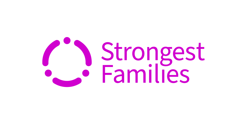
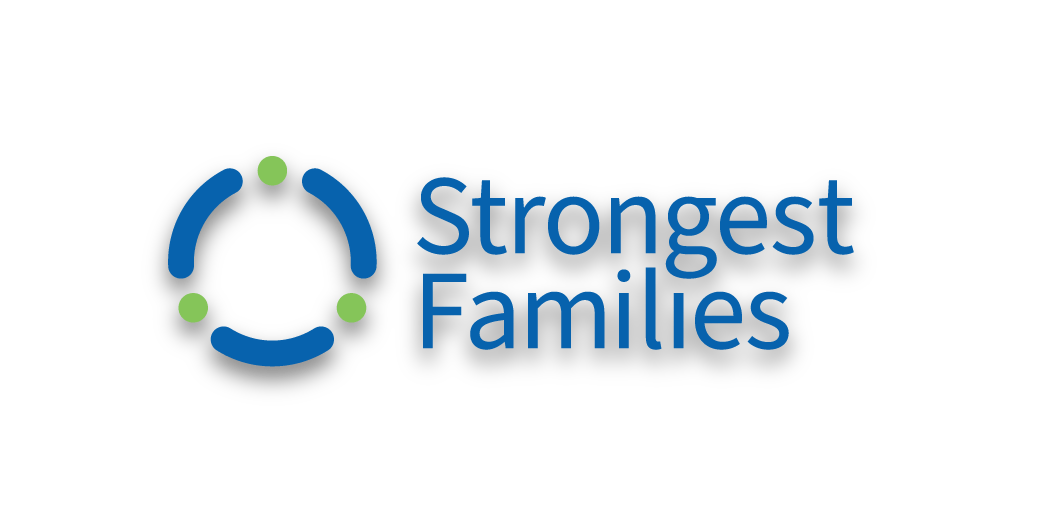
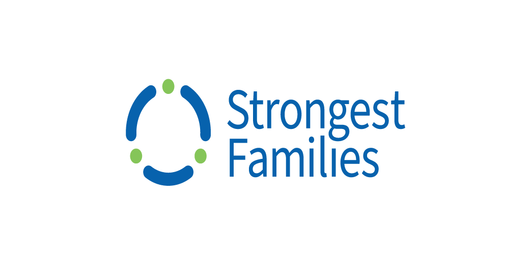
To maintain the integrity of the SFI brand, and to prevent the dilution of the brand it is important to follow the guidelines presented here. Some specific examples of logo crimes are listed here for reference:

Partner Communication
When providing the SFI logos to external partners it is important that the best effort is put in to ensure brand integrity. Please share links to this guide for partners to reference.
Links to sections within pages can be obtained by clicking the link icon that appears when you hover or click a section heading.
